Painho Pera Rocha
Central de Frutas Painho (CFP)

concept
illustration
visual identity
illustration
visual identity
This concept was developed as a proposal for Central de Frutas do Painho (CFP) within the context of a professional collaboration with This is Pacifica. Although the design was not realized, it served as an exploration of how to visually convey the essence of the Rocha pear.
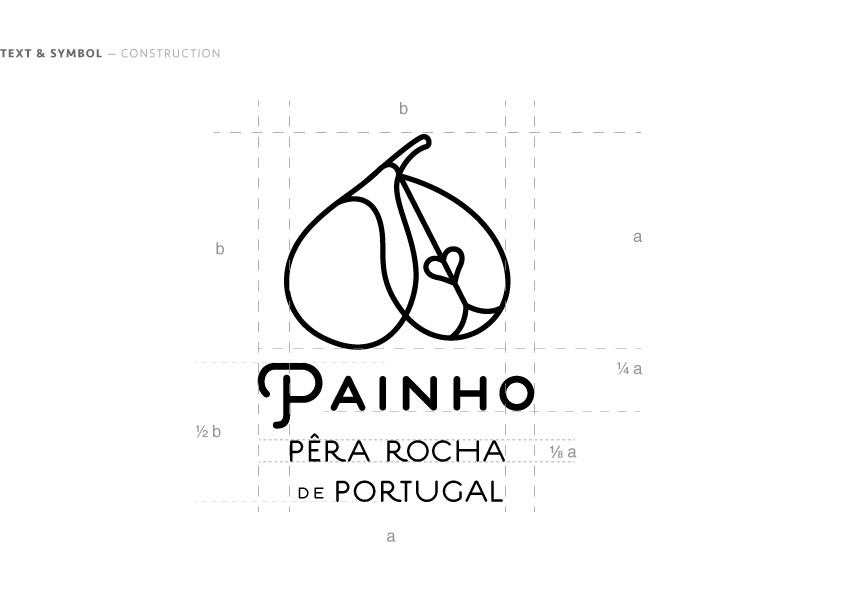
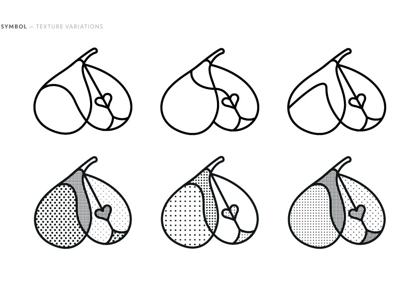
The branding explores the relationship between the pear’s exterior and interior, creating a metaphor that connects appearance and taste, surface and quality, reason and emotion. Drawing inspiration from the pear’s light green to golden-yellow skin, distinctive russet texture, and grainy white flesh, the design reflects its authenticity and uniqueness.
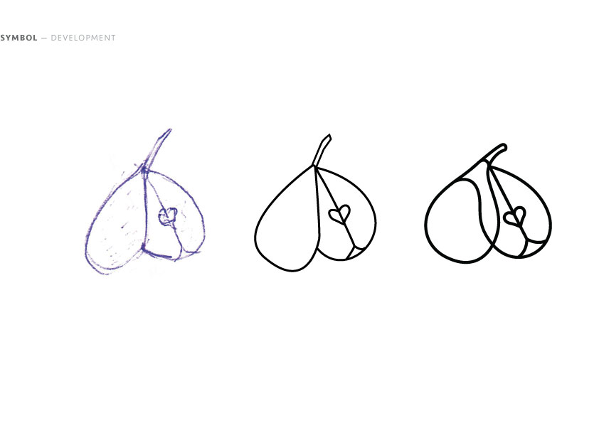
A central element is the heart shape, a prominent visual motif deeply embedded in Portuguese culture, found in traditional calçadas (paved sidewalks), embroidery, porcelain, and other crafts. This symbol forms the core of the design, representing both the fruit’s essence and its cultural significance. The identity is expressive and market-driven, distinguishing Painho while maintaining a cohesive link to CFP’s broader brand.
The branding explores the relationship between the pear’s exterior and interior, creating a metaphor that connects appearance and taste, surface and quality, reason and emotion. Drawing inspiration from the pear’s light green to golden-yellow skin, distinctive russet texture, and grainy white flesh, the design reflects its authenticity and uniqueness.
A central element is the heart shape, a prominent visual motif deeply embedded in Portuguese culture, found in traditional calçadas (paved sidewalks), embroidery, porcelain, and other crafts. This symbol forms the core of the design, representing both the fruit’s essence and its cultural significance. The identity is expressive and market-driven, distinguishing Painho while maintaining a cohesive link to CFP’s broader brand.
Moodboard

Process