Aveiro City App
Case-Study City App Re-Design
concept
ux/ui design
ux/ui design
How can a city app reflect not only usability but also the character of the city it represents?
Aveiro already has a well established corporate design including a distinctive logo and visual identity that extends beyond architecture to all city media. Despite this strong branding the existing Aveiro City App suffered from usability problems. Cluttered layouts and confusing navigation meant the app failed to deliver a smooth user experience or convey the city’s unique spirit effectively.
This project aimed to close the gap between the city’s graphic identity and digital user experience. By rethinking the app’s structure and interface design I worked to create an intuitive and accessible tool that honors Aveiro’s branding while offering clear navigation and functionality tailored to the needs of residents and visitors.
PROCESS
Existing Design:


I. Heuristic Evaluation
Using Jakob Nielsen’s principles, I found major usability issues like inconsistent design, unclear navigation, and poor prioritization. These guided a simpler, clearer app structure.
Using Jakob Nielsen’s principles, I found major usability issues like inconsistent design, unclear navigation, and poor prioritization. These guided a simpler, clearer app structure.
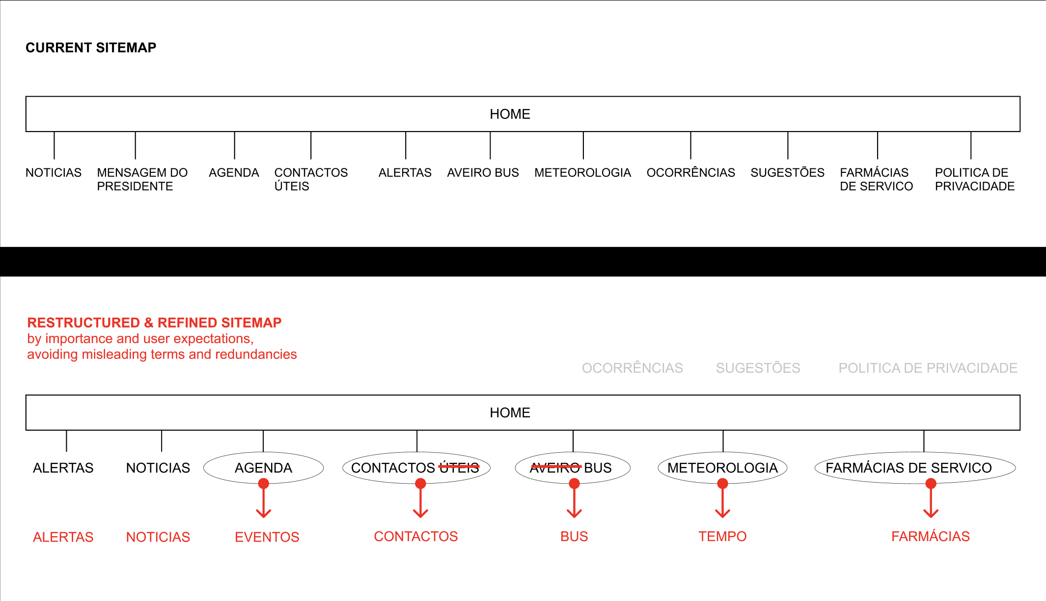
II. Information Structure
I reorganized the sitemap to prioritize user needs. Alerts were redesigned to appear only when necessary and archived after reading. Menu items were renamed for clarity, and secondary info was moved to a less prominent area, making navigation more intuitive.
I reorganized the sitemap to prioritize user needs. Alerts were redesigned to appear only when necessary and archived after reading. Menu items were renamed for clarity, and secondary info was moved to a less prominent area, making navigation more intuitive.

III. Competitive Analysis
I analyzed other city apps to learn what works. Some improved usability but lacked identity; others were clear but generic. These insights helped balance function with Aveiro’s unique character.

IV. Aveiros Visual Identity
Inspired by Aveiro’s Corporate Design, it’s vibrant colors, striped houses, and Art Nouveau style, I created a moodboard to merge the city’s identity with modern digital design for a cohesive user experience.
Inspired by Aveiro’s Corporate Design, it’s vibrant colors, striped houses, and Art Nouveau style, I created a moodboard to merge the city’s identity with modern digital design for a cohesive user experience.
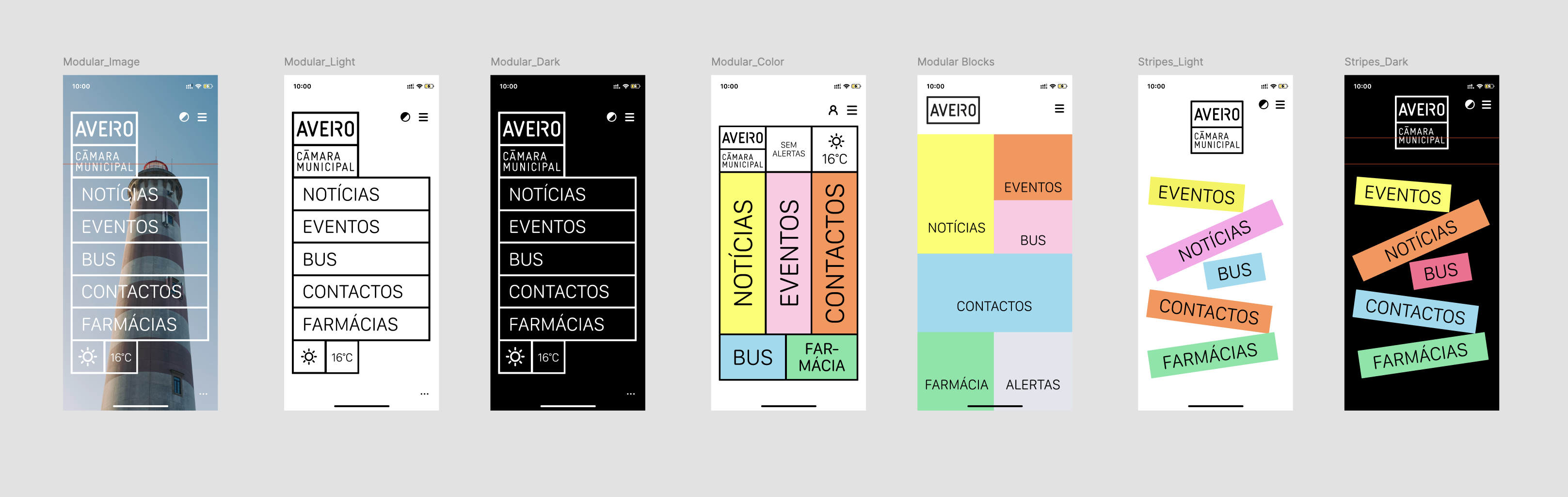
V. First Drafts
Early designs integrated Aveiro’s visual style but were too complex for some users. Feedback led to a simpler, more accessible look without losing the city’s character.
Early designs integrated Aveiro’s visual style but were too complex for some users. Feedback led to a simpler, more accessible look without losing the city’s character.
VII. Final Prototype
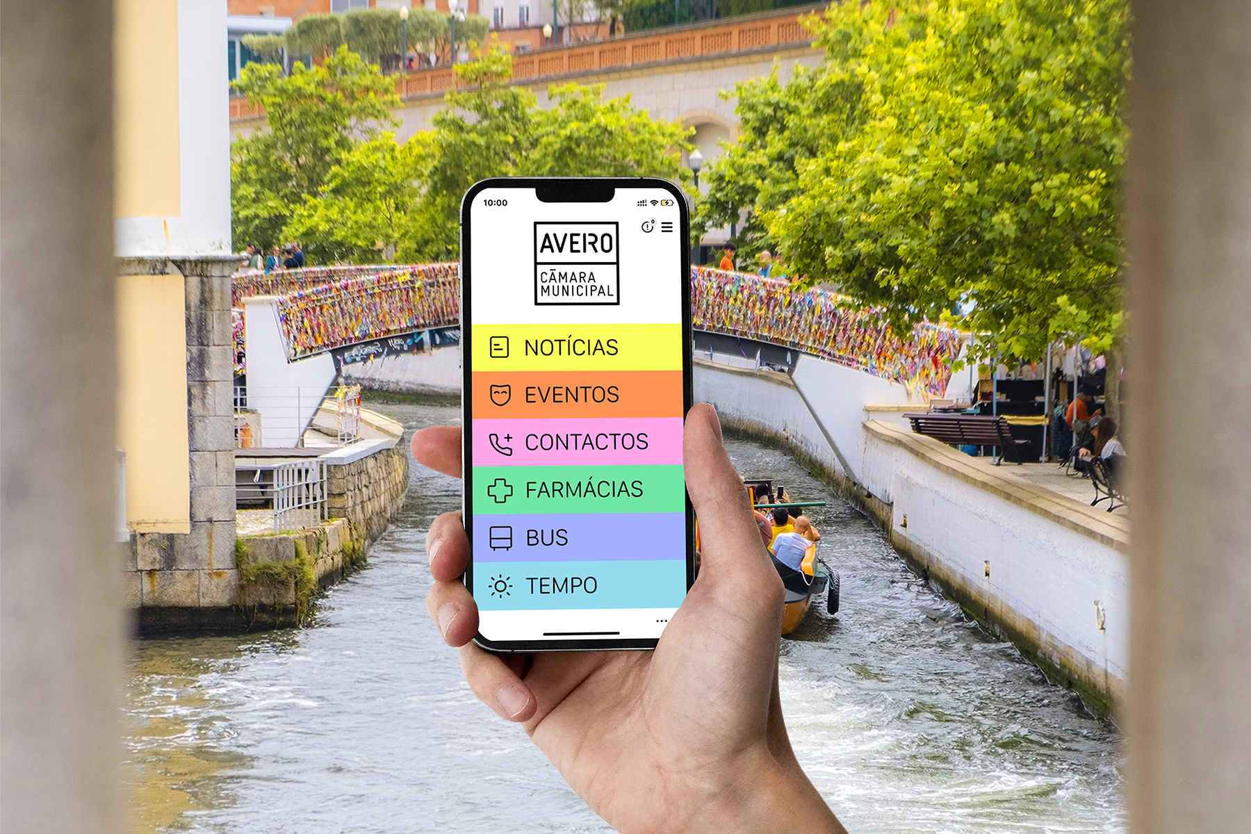
The final design balances function and identity, using color and patterns sparingly to improve readability and accessibility. Clear icons and typography guide users smoothly while preserving Aveiro’s unique feel.
The final design balances function and identity, using color and patterns sparingly to improve readability and accessibility. Clear icons and typography guide users smoothly while preserving Aveiro’s unique feel.
