Aveiro City App
UX/UI Design
Case Study
UX/UI Design
2024 | 1-week Sprint
2024 | 1-week Sprint
How can a city app reflect not only usability but also the character of the city it represents? Growing up in Aveiro, I’ve always appreciated the city’s vibrant colors, iconic striped houses, and its warm, inviting atmosphere. However, the existing Aveiro City App felt disconnected — with a cluttered interface and confusing navigation, it neither captured the city’s essence nor served its users effectively.
My goal was to redesign the app with a focus on functionality while integrating the visual and cultural identity of Aveiro. By rethinking its structure and design, I aimed to create an intuitive and accessible tool that feels authentic to the city and its residents.
My goal was to redesign the app with a focus on functionality while integrating the visual and cultural identity of Aveiro. By rethinking its structure and design, I aimed to create an intuitive and accessible tool that feels authentic to the city and its residents.
Current app

PROCESS
I. Heuristic Evaluation
Using Jakob Nielsen’s heuristic principles, I identified major usability problems such as a lack of consistency, unclear navigation, and a failure to prioritize key information. These insights guided my approach to restructuring and simplifying the app.
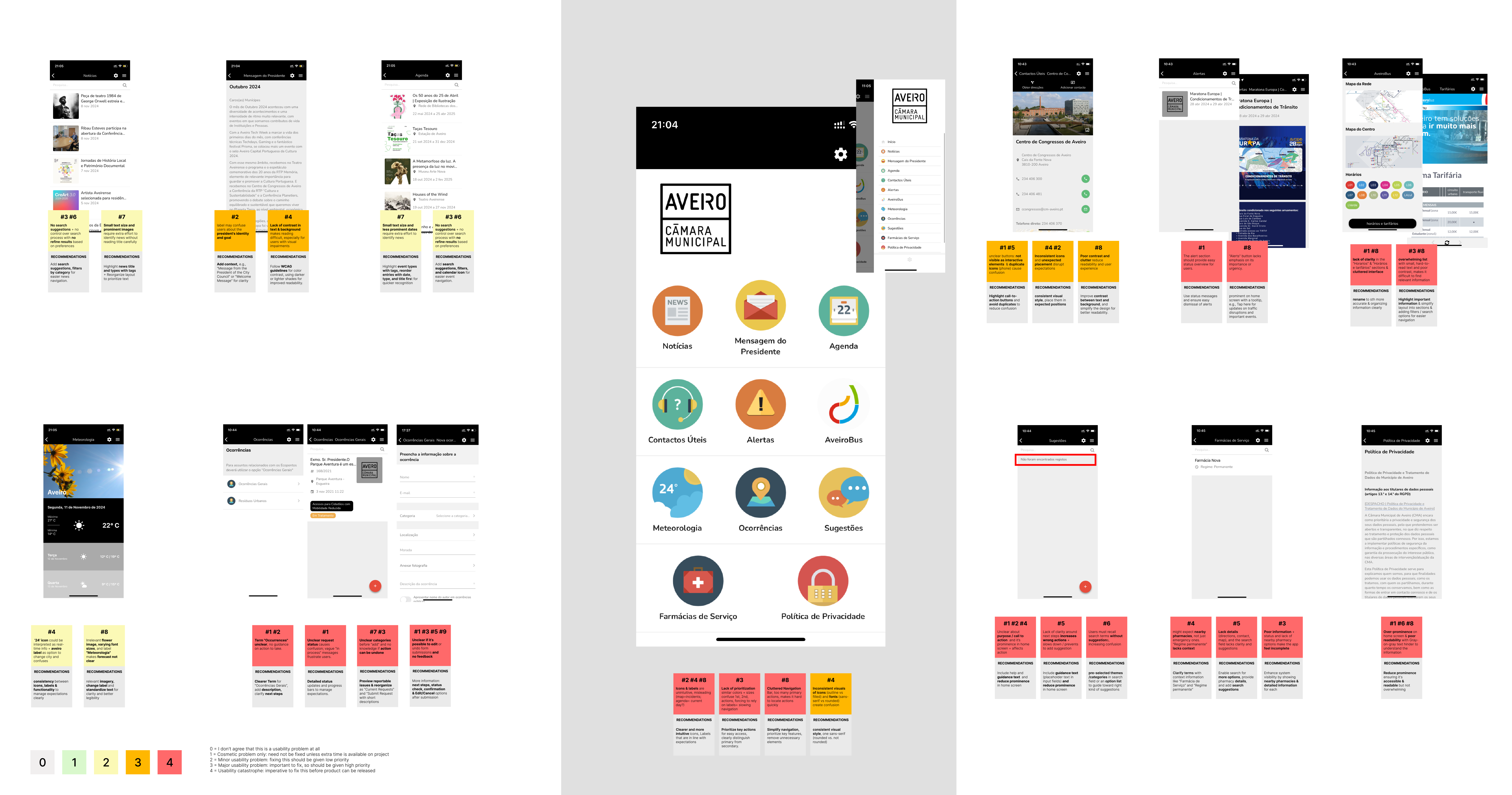
II. Information Structure
To prioritize user needs and improve clarity, the sitemap had to be reorganized first: Dynamic alerts were removed from the main menu and designed to pop up only when necessary, ensuring users are informed of urgent updates without cluttering the interface. Key elements were renamed for better understanding. The “Message from the President” was moved to the “News” section to align with its occasional relevance. Additionally, secondary information like privacy policies was grouped into a bottom menu, reducing distractions in the main navigation
III. Competitive Analysis
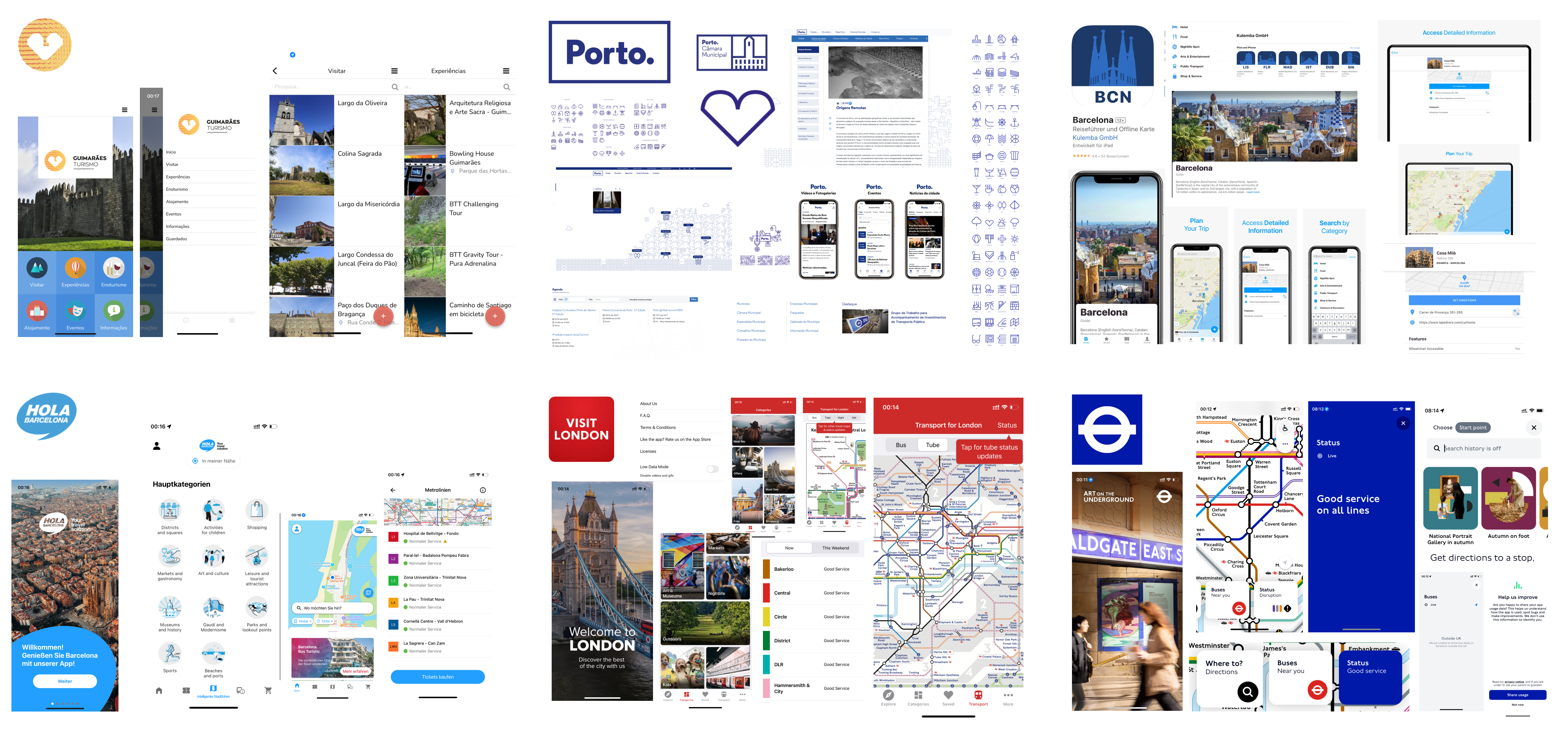
To understand how city apps address usability and identity, I analysed other city apps. The Guimarães app, developed by the same team, improved usability but remained cluttered and inconsistent. Porto’s minimalist design was user-friendly but lacked local character, while many cities rely on the same developer, resulting in uniform apps that sacrifice individuality. Even transport apps like London Underground excel in navigation but miss cultural relevance. These insights shaped my approach to redesigning the Aveiro City App, ensuring it combined functionality with the city’s distinctive identity.
IV. Aveiros Visual Identity
I then transitioned to the visual aspect, immersing myself in Aveiro’s distinctive visual identity, defined by its strong branding and design elements. The city's vibrant colors, iconic striped houses, and Art Nouveau style are integral to its cultural identity and served as the foundation for the moodboard. The goal was to merge these unique features with modern design approaches, crafting a digital experience that strengthens the connection between the city and the app, while offering an engaging user experience.


V. First Drafts
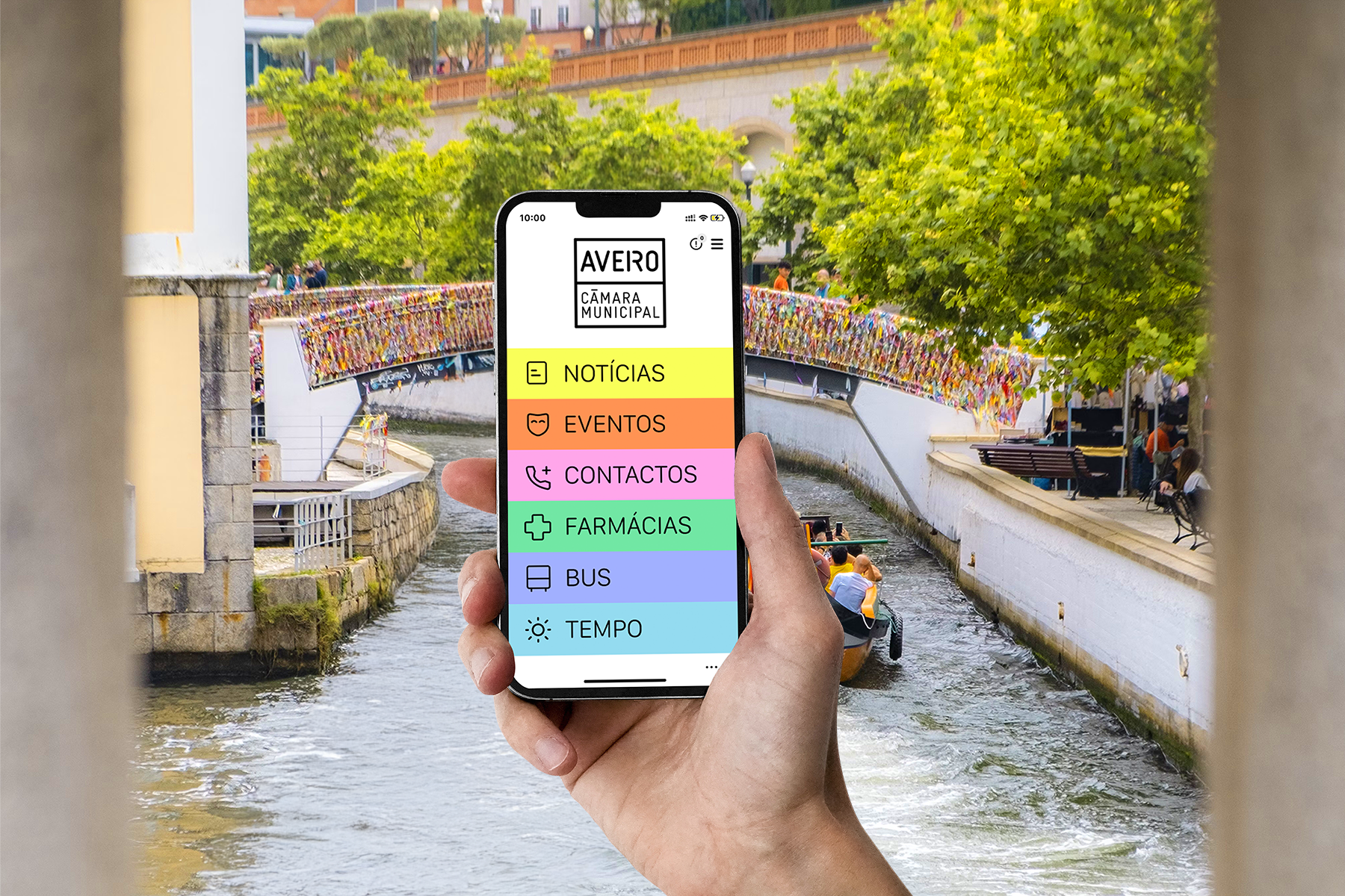
With the first drafts, I aimed to restructure the navigation and integrate Aveiro’s visual concept, featuring its bright colors and patterns. Although visually engaging, the aesthetic presented accessibility challenges, particularly for elderly users, those less familiar with apps, and users with visual impairments. Since a city app is intended for a wide range of users, this feedback led to a simplified approach, balancing aesthetics with improved readability and accessibility.

VII. Final Prototype
The final prototype aimed to create a seamless balance between functionality and Aveiro's cultural identity. I simplified the visual design, using Aveiro’s iconic colors and patterns in a more restrained way to enhance accessibility and readability. Key features, such as color-coded tabs and clear icons, were introduced to guide users intuitively through the app. The typography was adjusted to ensure it was legible for all users, including those with visual impairments. The final result is a clean, user-centered design that maintains the city’s unique essence while providing an accessible and intuitive experience for residents.